SAM KAPLAN
|
PERSONAL BACKGROUND
Sam Kaplan was born in Boston, Massachusetts. He studied art history and sculpture at Wesleyan University and had a double major in Studio Arts and Art History. He founded his photography studio “The Kaplans” with his wife in 2011. He works together with his wife in a “creative duo”. Sam Kaplan is the one who takes all of the photos. His wife, Laura Kaplan, is the one who comes up with ideas for shots. |
|
STYLE
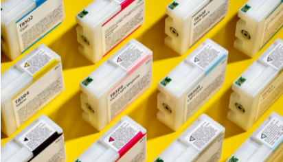
Many of his photographs have rows of objects. An example of this would be the printer ink cartridges. I would describe his style as simple, but eye-catching. He does promotional photos for companies, and also some on his own time. The photos have simple color backgrounds that really draw your attention to the object.
PHILOSOPHY
He says his philosophy is: ‘Simplify”. His works are definitely simple, but effective. Since his photos are mostly promotional, they focus a lot on the product and not much on backgrounds to make the object pop. Some of the photos are set up as patterns or rows to also draw attention to the subject. His photos combine color and simplicity to make his photos unique.
INFLUENCES
He is influenced by his clients and how they want a promotional photo or video to look. His photos have the product at the center of attention, which is a trait of promotional photographers. He hasn’t really influenced me with taking photos because I like taking landscape photos more than still life and object photos. Because of this, I focus more on photographers that take landscape photos.
COMPARE AND CONTRAST
Untitled
|
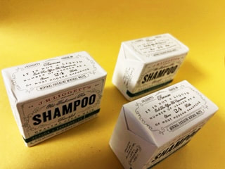
Shampoo
|
For the first one I didn’t really have anything that looked similar other than these bars of shampoo. I think in the original it’s printer ink cartridges. I also didn’t have enough of these bars of soap to really replicate the original, so I'm not very proud of this one.
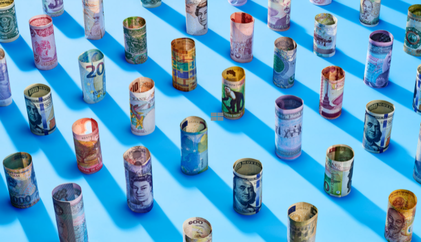
Untitled
|
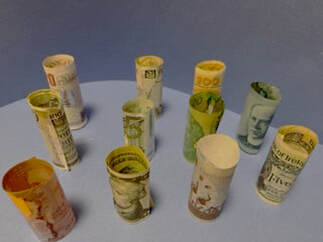
Foreign Money
|
This second one is a bunch of money (foreign and U.S.), rolled up on a blue background. I have more foreign money than soap bars so this one was easier to figure out. I couldn’t find a background that was the exact same color, which is why they’re slightly different colors.
Untitled
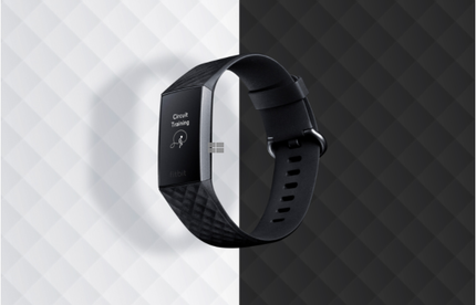
|
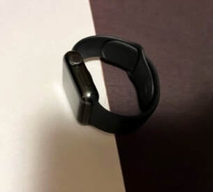
Watch
|
The last one was probably the easiest because I didn’t have to search for anything. I used my apple watch, (which in the original I think is a fit bit) but they still look kind of similar. For this one I just laid my watch on a half black, half white paper and took a picture. It would have been better if I had hung it up somehow in front of the background but I didn’t know how to do that successfully.
ARTIST STATEMENT
I think that the one that turned out the best was the one with the money. It was the most fun to take because I got to look at money from Ireland, the United Kingdom, and Denmark. The watch on didn’t really turn out as well as I thought it would, but it's still okay. The one with the shampoo is still my least favorite because I took so many shots but none of them turned out the way I wanted it.
